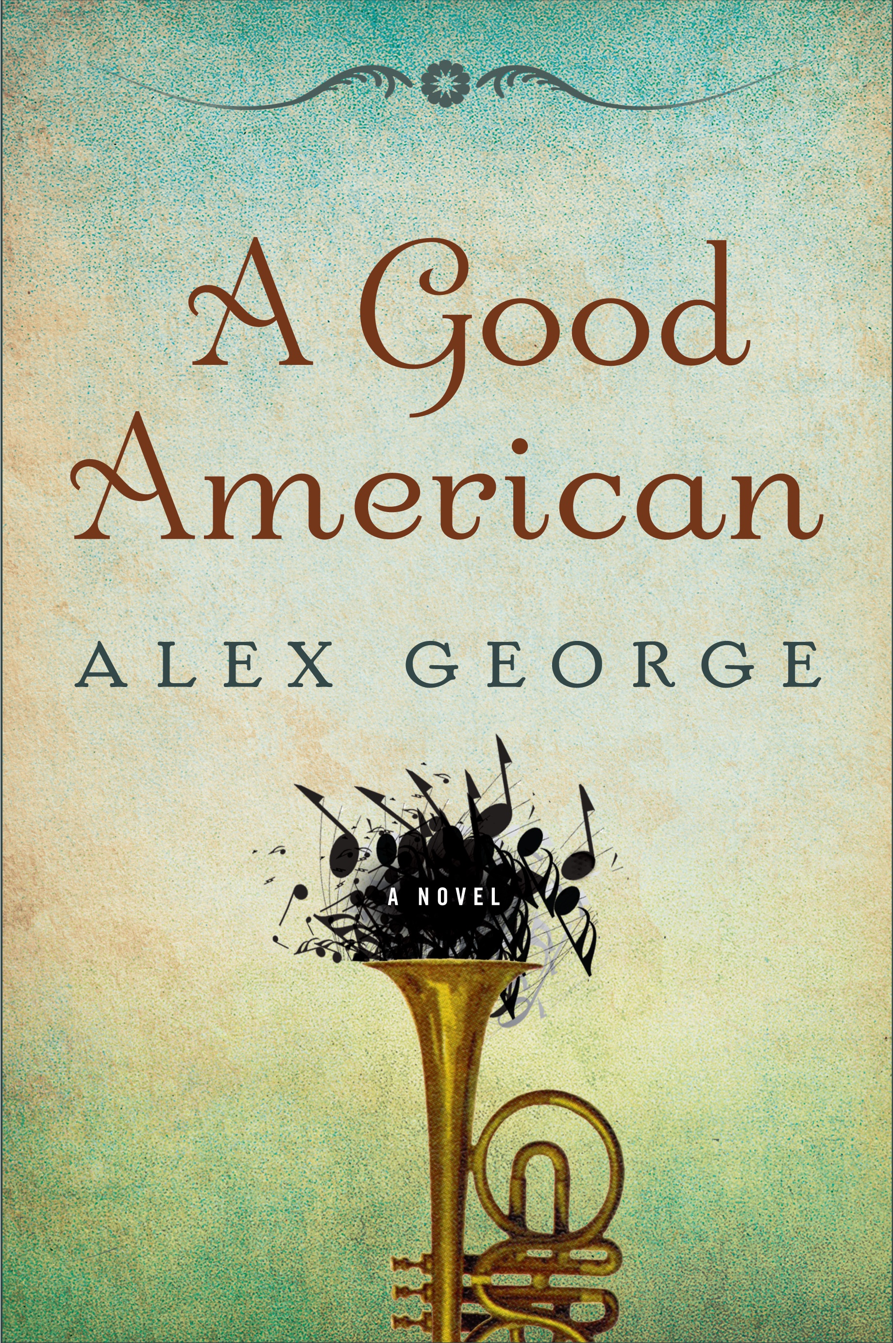
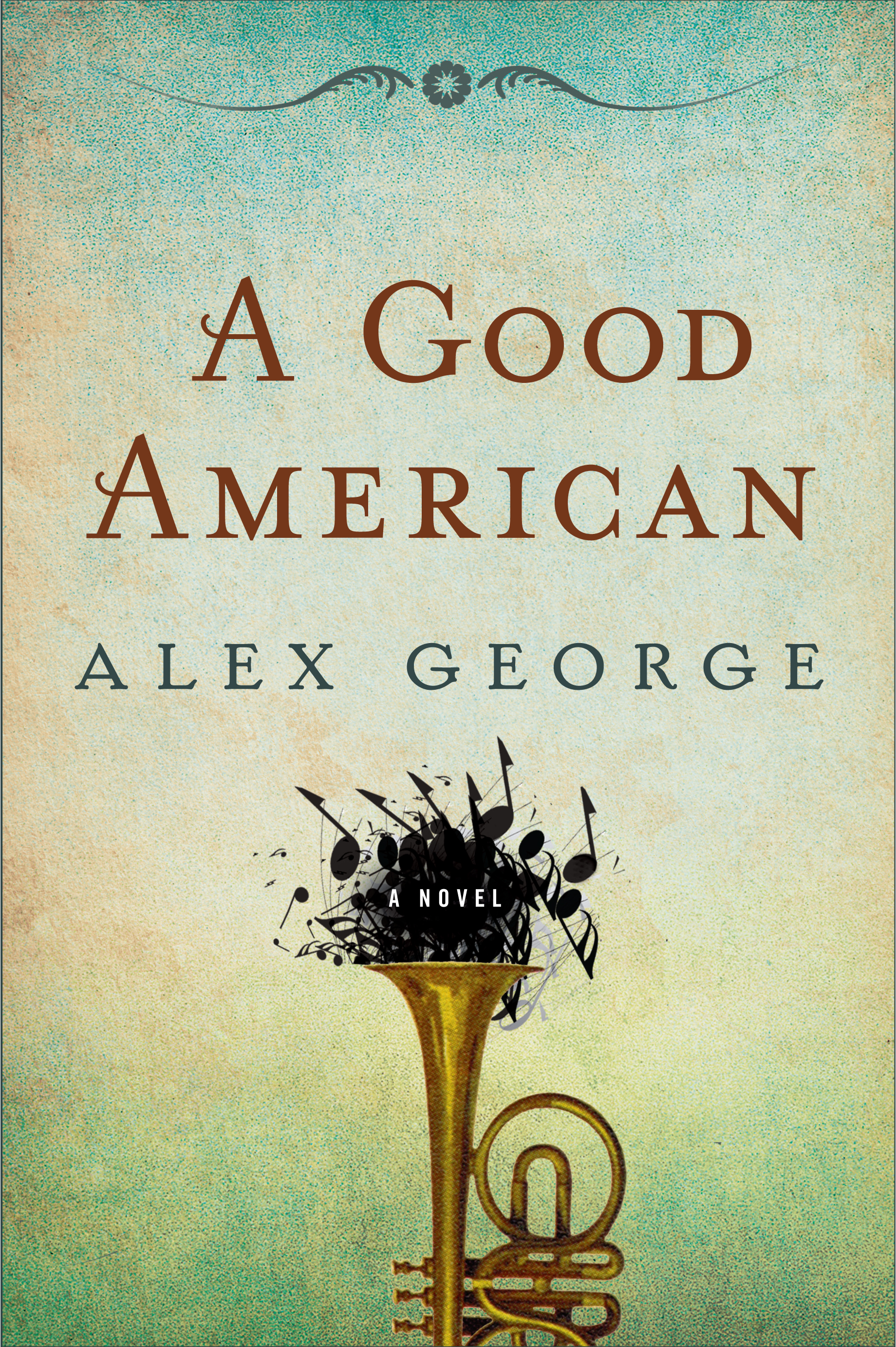
I’ve written here at some length and on numerous occasions about just how much I love the cover of A GOOD AMERICAN. I think it oozes class and is both evocative and beautiful. Of course I am biased, but most people I’ve spoken to seem pretty keen on it, too.
But these things, I am learning, are fluid and can always be improved. Despite all the swooning over the cover, Amy had mentioned when we were in Minneapolis that she was having second thoughts about the lettering. She wondered whether there was too much curlicue, if it might all be a little too feminine. I thought no more about the conversation until an email arrived last week with a new cover with redesigned lettering on it.
And just when I thought I couldn’t love something more, I discover that actually I can. Here is the old cover:

And here is the new one, with the revised, simpler, title font:

I really like this a lot. It’s unfussy, and (I think) even more elegant that its slightly more flamboyant predecessor. What do you think?
What I like best about this story is how it shows that really, really good editors and publishers don’t stop just because they know they have something good. They are constantly searching for ways to improve the product. No detail is too small to be re-examined.
Lucky is the author who gets to work with such people.

Comments 8
This is what I miss about working in graphic design–the continuing “tweaking” of elements and the amazing result that comes from the slightest details being reworked. I loved the first iteration of your cover but seeing this revision, Amy’s point is right on. Remarkable how just the smallest tweaking of a font or an element shifted up or down, left or right, can have such a dramatic impact on the overall feel of an image.
Author
Thanks, Erika! I KNOW. I have never been so involved in the process with any of my covers before and it has been an education and a privilege (and fun!) to watch.
That’s an amazing difference! I would never have thought of the previous incarnation as “too feminine”, but the new one is much bolder and stronger, without being over-the-top. I wonder if anyone has studied the message(s) that a particular font sends to the reader ……
I really liked the cover before! But I like the changes — am I right that the decal thingy at the top is also grayer and the lettering is browner? (Or is it just a lighting difference?) Anyway, I like the fact that it seems overall more subtle. So interesting to watch this, having never gone through it, and see how things progress!
I love the new font! Great transition. To me it’s more solid and firm.
Love it! Font choice is so important. I sit with a group of graphic designers at the paper, and we’re constantly extolling the virtues of such-and-such font or deriding the use of others (like Comic Sans. Please God, no). The new cover’s font is great, and I love the cover! Can’t wait to read it.
I have the old version. Collector’s item!
Author
Kit – I’m glad it’s finally arrived!