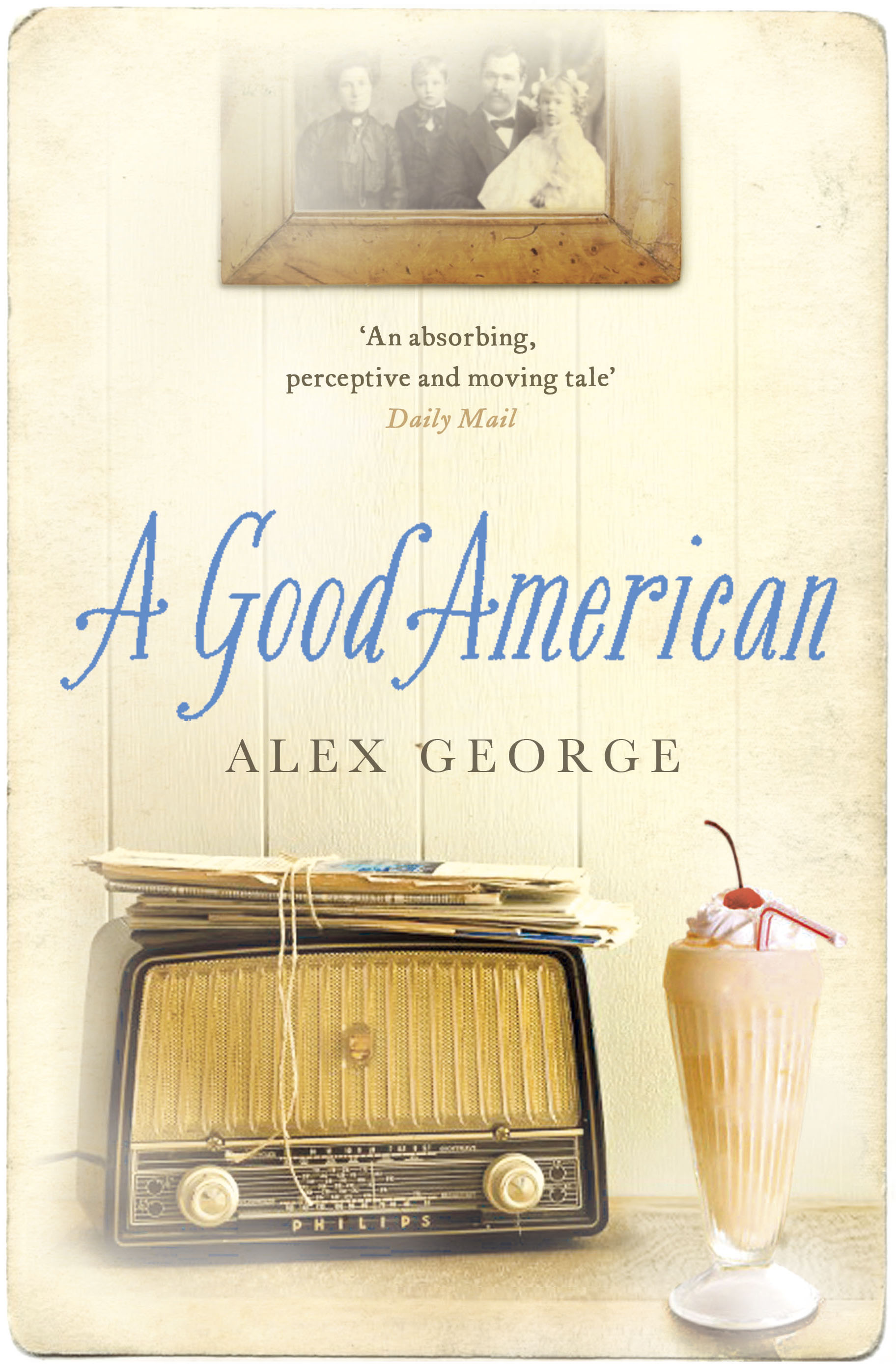
In August A GOOD AMERICAN will be published in the United Kingdom by Fig Tree Books, an imprint of Penguin UK. (Fig Tree also brilliantly published The Help in England to massive success.) I met my lovely editor there, Juliet Annan, several months ago in London. She told me right away that the English edition would have a different cover from the US version.
Much as I love the US cover, I understood and expected this. Every time I go to a bookshop in England I am always struck by how very different book jackets are designed, in comparison to the States. As a general rule, in the UK publishers tend to use more photographs – over here, more oblique designs and illustrations are more prevalent.
Here is what the Penguin UK art department have come up with (complete with fake quote from the Daily Mail!) I’d love to know what you think.


Comments 11
I have to admit, I really love the UK cover. Much as I liked the US one, I do think this one would pull me in more. Before I was a blogger and followed book blogs and readers’ sites I was very driven by book covers and jacket blurbs, and I can tell you this one would get my attention.
Congrats again Alex!
I think it provides a good visual synopsis of the book. I would be just as pleased to see this cover here in the U.S.
Interesting….I love the photo, and the letters and old radio give it ambience. (Being in radio, I LOVE the use of old radios!) I also like the type font. However, I’m not overly excited about the ice cream soda… somehow strikes me as too shiny and cute. But that’s just me.
I’m also always interested in how US and UK covers differ. With many UK authors, I prefer their UK covers; often these covers are elegant, clever, or interestingly traditional. I find that your UK cover is more “traditional,” but old-fashioned. While it captures the historical aspect of your novel, the one thing that this cover fails to grasp is the musical aspect (the radio doesn’t do it for me). And I also consider that your telling the story of American history through a family’s life makes the history immediate and modern. This cover puts the reader in the past. So while just looking at it, I don’t mind it, but having read your book, I think the US version is much better suited to your story. That said, considering that this is meant for a UK audience that hasn’t been steeped since childhood in US history, these obvious visual clues might help readers feel more connected.
As a Brit, I think I’m used to seeing book jackets like this. It’s fairly ‘typical’ of general popular fiction. The design gives the book a sense of place in time; perhaps those visual clues are more easily identified by us Brits in photographic form, rather than illustrative? Also, the use of photographs automatically provides a sense of reality (those are ‘real’ people in the family portrait; the wireless is a genuine Philips model, etc). Before you’ve even started reading, you’re creating real-life history with the characters. Looks great. (p.s. I automatically identified the ice cream soda as an ‘American’ item – is that a cliche?).
Is it also true you’re from Marlborough, Wilts? I’m sitting in my work office in Marlborough right now!
Author
Jon – yes! Marlborough born and raised. My parents still live there, just off the High Street!! What a small world.
Author
Thanks for everyone’s comments so far. One of the problems with a “big” book with lots of themes is that no designer in the world can possibly hope to capture them all with a single image or set of images. I was delighted when Penguin US went all-out for the music angle… I think this speaks to broader themes in the novel. I like ’em both.
Yes indeed. Great to hear of your success in the US – I look forward to seeing ‘A Good American’ in the White Horse Bookshop 😉
While I really love the US cover, I DO like that the UK cover shows the passage of time contained within. While I like the photo, I think I’d associate the characters with the image. Jette in the photo doesn’t look like Jette in my head. But this isn’t a complaint at all — the UK cover really gives a sense of time, and I love that.
Both are lovely, but I think I like this one better. It gives some clues as to the themes and subject matter and creates more of a mood. Either way, I just got the book and it’s up next TBR! As soon as I finish the final round of edits on my own novel. 🙂